
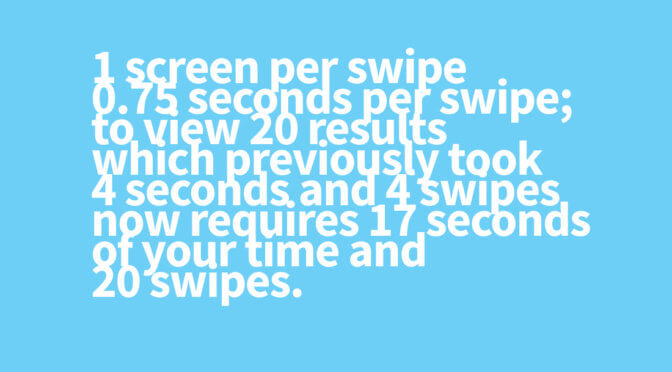
A few years ago Apple changed the search results layout of their App Store to let a user see ONE RESULT per page rather than multiple apps. You need to swipe 20 phone screen views up to view 20 apps based on your search results rather than see 3 to 5 at a time.
Now that the X series have longer screens, this became unpleasantly irritating, at least to me. To search for a particular app by keyword has never been more painful than ever, by Apple’s great UX — one app at a screen.
Larger screens, larger images. How much more scrolling do you need @Apple ? Copying Google’s unusable large whitespaces? If only Steve is alive to see how much scroll you require your users now. One app per scroll—you must have a lot of time to swipe up and down @tim_cook pic.twitter.com/zdaTxLDYXx
— Cheryl Fuerte (@cherylfuerte) June 25, 2018